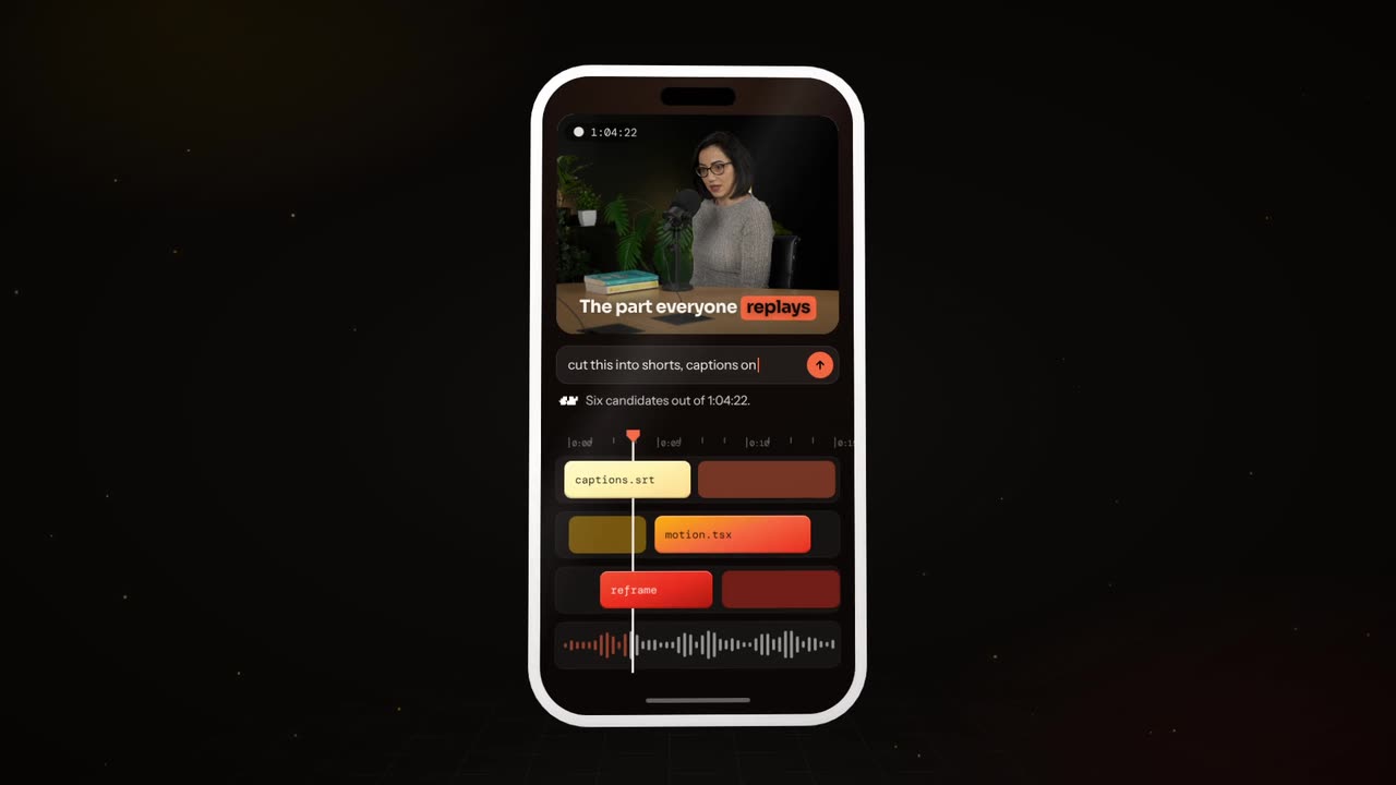
To add animated feature callouts to a product screenshot, place a sharp 2x screenshot in a laptop or phone frame and pick three to five features with a short benefit label each. Zoom to one feature at a time for 3 to 4 seconds while its callout draws in, then pull back and end on one call to action.
Real outputs from the Videotto template gallery.
Feature callout tools compared: After Effects, Canva, Rotato and Otto
There are four common ways to put animated callouts on a screenshot, and they trade control for time. The right one depends on whether you need a single hero video or a callout clip for every release.
Typical effort for one 20 second callout video (estimates, not benchmarks)
| Method | How the callouts are made | Typical time | Best when |
|---|---|---|---|
| After Effects | Keyframed position and scale on the screenshot, shape layers for pointer lines, text layers for labels | Roughly 2 to 4 hours for someone fluent | You need frame-exact control or a reusable template |
| Canva | Zoom and pan page animations, static arrows and text boxes | Around 30 to 60 minutes | Simple social posts where a few slides are enough |
| Rotato or a Figma plus Jitter setup | 3D device mockups and smooth camera moves, labels added on top | About 1 to 2 hours | A premium device shot for a launch page |
| Otto | A written brief with the features, their positions and labels, then revisions in plain language | Typically 10 to 20 minutes including two or three revisions | Every feature update, in several aspect ratios |
If you have a real screen recording of someone using the product, that is an app demo, and it needs cuts and zooms on the recording instead. This page is about still screens.
How to build a feature callout video in 6 steps
- Take a sharp screenshot. Capture at 2x if you can (a 1440x900 display on a Retina Mac gives a 2880x1800 image). Use realistic sample data and nothing private. One screen per video works best.
- Pick three to five features. Choose the ones a new user cares about and write each as a benefit of two to five words: "Find any invoice in seconds", not "Search bar".
- Say where each feature is. "Top right", "left sidebar", "the big button at the bottom". Plain positions help the zoom land on the right spot the first time.
- Choose the frame and colours. A laptop frame for desktop software, a phone frame for apps. Give your brand colours as hex codes so the highlight ring and labels match your site.
- Add a hook and a close. A first line that names the problem in under eight words, and an end card with the product name and one call to action.
- Export per placement. 9:16 at 1080x1920 for Reels, Shorts and TikTok, 1:1 at 1080x1080 or 16:9 at 1920x1080 for your site, LinkedIn and launch posts.
A feature callout prompt for Otto
Adapted from the way Videotto users brief Otto for product launch motion. Replace the features, positions and labels with yours, and keep the restrictions line so the screenshot itself is never changed.
Turn my uploaded product screenshot into a 20 second feature callout video, 9:16 vertical.
FRAME: place the screenshot in a clean floating laptop frame on a soft gradient #F5F7FF to #E3E8FF.
FEATURES (zoom to each in this order):
1 [location]: "[benefit label]"
2 [location]: "[benefit label]"
3 [location]: "[benefit label]"
CALLOUTS: a white pill label with a thin line pointing to the feature, a small line icon, and a soft highlight ring around the feature in #5B5BF7.
ANIMATION SEQUENCE:
0 to 3 s: hook text "[problem in one line]", the laptop rises into frame.
3 to 15 s: the camera glides and zooms to each feature, the callout draws in, hold 1 second, move on.
15 to 20 s: pull back to the full screen, end card "[product name]" and "[call to action]".
SOUND: soft click per callout, light upbeat music.
RESTRICTIONS: do not change anything inside the screenshot, keep labels exactly as given, no bouncing.
Shorter feature callout prompts
- "Zoom into each feature on this screenshot with a label."
- "Put the screenshot in a phone frame and float it in 3D."
- "Three callouts, one per feature, then a logo end card."
- "Add a voice over reading each label."
- "Same video, 1:1 for the landing page, no sound."
Example: a 20 second feature callout video for an invoicing app
This is an illustrative example, not a customer project. The input is one 2880x1800 screenshot of a made-up invoicing dashboard with sample client names, and three features the team wants to announce.
The brief fills the prompt above with: hook "Still chasing late invoices?", feature 1 top right "Send reminders automatically", feature 2 centre "See who paid at a glance", feature 3 bottom left "Export to your accountant in one click", call to action "Try it free for 14 days".
| Time | On screen | Label words |
|---|---|---|
| 0 to 3 s | Laptop rises on the gradient, hook line above it | 4 |
| 3 to 7 s | Camera glides top right, ring and pill draw in | 3 |
| 7 to 11 s | Camera moves to the centre table, second callout | 6 |
| 11 to 15 s | Camera drops bottom left, third callout | 7 |
| 15 to 20 s | Pull back to the full screen, end card with the offer | 6 |
Each label is under eight words, so at a reading speed of roughly 3 words per second it is readable inside the 4 second window. The 1:1 landing page version is one more line: "same video, 1:1, no hook text, silent loop".
Callout styles and design choices
Pick one callout style and use it for every feature, so the video feels designed rather than decorated. The table covers the choices that matter most on a phone screen, where a full screenshot is too small to read without the zooms.
| Choice | Safe default | Try instead when |
|---|---|---|
| Frame | A clean laptop or phone frame | A floating screen with rounded corners for web apps |
| Callout style | Pill label and thin pointer line | A spotlight that dims everything else, for one hero feature |
| Type | One sans serif, labels of two to five words | A heavier weight if labels sit over a busy screen |
| Motion | Smooth glides and zooms with a highlight ring | A pop-out card that lifts the feature off the screen, for launches |
| Timing | Three to four seconds per feature | Five seconds if a voice reads each label |
If you are comparing what each plan includes, a callout video is the wrong shape. Use a pricing comparison layout instead, with columns and ticks.
Feature callout mistakes that make a promo hard to read
- Labelling every button. Ten callouts is a manual, not a promo. Three to five features, the ones that sell, keeps the video under 25 seconds.
- Feature names instead of benefits. "Export panel" says nothing. "Export every size in one click" says why it matters.
- Real customer data on screen. Use sample data in the screenshot. Never show real names, emails or account numbers, even blurred.
- Labels in the app button zone. On 9:16, keep callouts out of the bottom fifth and the right edge, where TikTok and Reels place their buttons and captions.
FAQ
What resolution should a product screenshot be for a promo video?
A product screenshot for a promo video should be at least as wide as the output and ideally twice that, because zooms magnify it. A 2x capture such as 2880x1800 stays crisp in a 1920x1080 video even when the camera pushes in on a button. Save it as PNG rather than JPEG so thin interface lines and small text do not blur.
Is it okay to use a mockup instead of the real product interface in a launch video?
Using a mockup instead of the real product interface is fine for a concept teaser, but a launch or ad video should show the product people will actually get. Advertising rules in many markets treat a misleading interface as a misleading claim. If a screen is still in design, label the video as a preview or wait until the feature ships.
How do I make a flat screenshot look 3D in a device mockup?
To make a flat screenshot look 3D, place it inside a device frame and tilt the frame a few degrees with a soft shadow underneath. Tools like Rotato do this with real 3D models, Figma can fake it with perspective plugins, and a prompt can ask for a floating laptop that turns slightly as the camera moves. Keep the tilt small so the text stays readable.
Where should I post a feature callout video?
A feature callout video works best in four places: the changelog or release post, the landing page hero as a silent loop, LinkedIn or X for B2B launches, and Reels or Shorts as a 9:16 cut. Export each version in its own aspect ratio rather than cropping one file, so the callouts never fall outside the frame.
Should a product feature video have a voiceover or just text?
Whether a product feature video needs a voiceover depends on where it plays. Landing pages and feeds autoplay muted, so the labels must carry the message alone. A voice helps on YouTube or in a sales email where people choose to watch. At about 150 words per minute, a 20 second video fits roughly 45 to 50 spoken words, so keep the script tight.
Make your next video with Otto
Tell Otto what you want in plain words. It cuts, captions and animates the video for you.