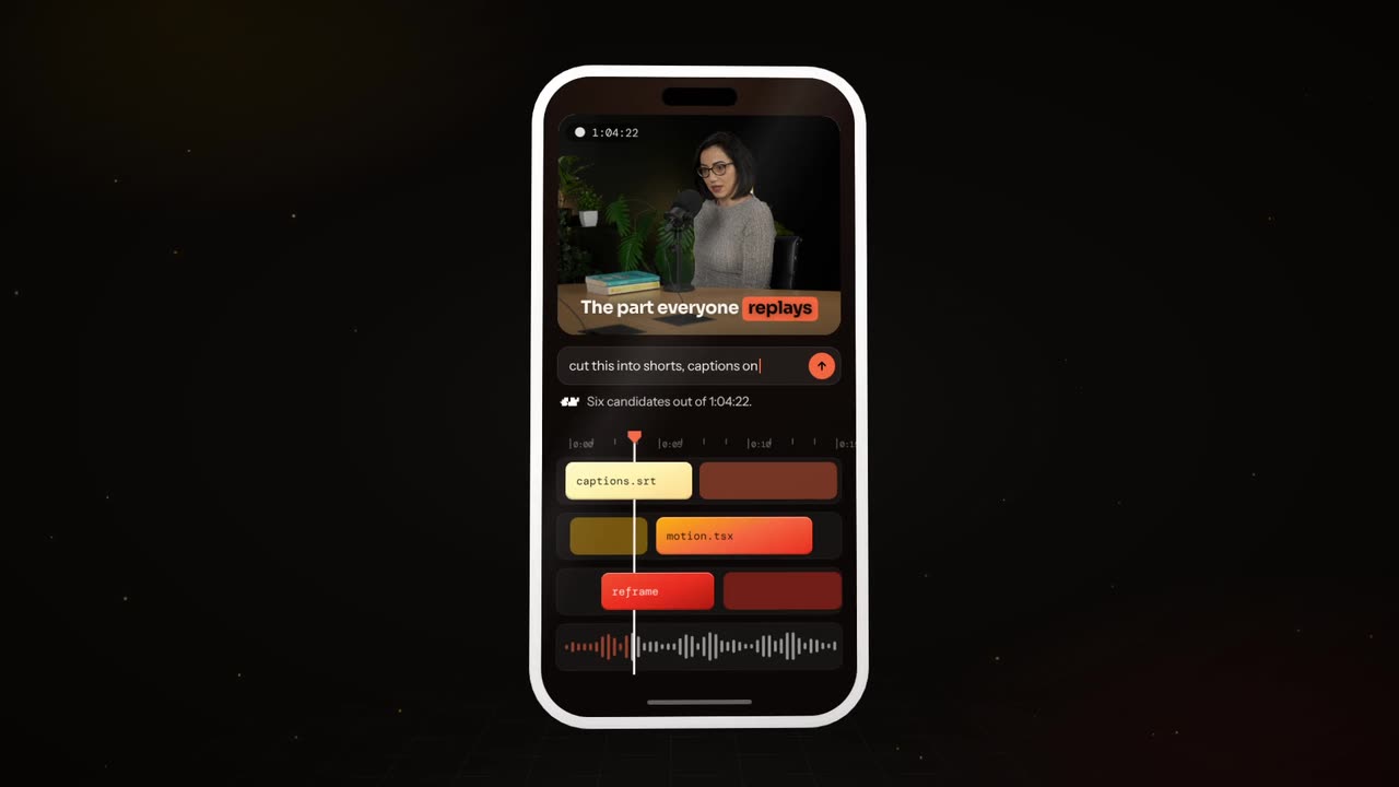
To animate app screens, upload clean screenshots or mockups and place them in a phone or laptop frame on a plain background. Pick one user flow, then have key elements lift out as cards, buttons press, numbers roll up and screens slide to the next step. Add a short label per step and end on your logo.
Real outputs from the Videotto template gallery.
Anatomy of an animated UI mockup
A good UI animation looks like the product on its best day. Clean data, smooth motion, nothing loading. These six parts make the look.
| Part | What it looks like | How to ask for it |
|---|---|---|
| Device | A phone or laptop frame, often tilted slightly | "the screens in a phone frame, slight 3D tilt" |
| Background | Soft gradient or brand colour, lots of space | "a soft brand colour background" |
| Cards | UI elements lifting off the screen with shadow | "the key card lifts out and floats beside the phone" |
| Interaction | A cursor or finger tap, a button press, a toggle | "a tap on the button, then the next screen" |
| Data | Numbers rolling, charts filling, lists populating | "the balance rolls up, the chart fills" |
| Sound | Soft taps, light whooshes, clean music | "soft tap sounds, clean upbeat music" |
Motion should follow how real interfaces behave. Cards ease out and settle rather than bounce. Buttons press down a touch before the next screen appears. Lists fill from the top one row at a time. Numbers roll quickly, then slow at the end. Keep one speed and one transition style for the whole video.
Worked example: a 25 second budgeting app animation
An illustration for a fictional budgeting app, built from three uploaded screenshots with sample data. One flow: connect a bank, see spending, set a goal.
| Time | Screen | Motion | Label |
|---|---|---|---|
| 0 to 3 s | Home screen in a tilted phone | Phone glides in from below and settles | "Your money, in one place" |
| 3 to 9 s | Connect bank | A tap on "Connect", a tick animates | "Link your bank in seconds" |
| 9 to 16 s | Spending chart | Bars fill one by one, the biggest category card lifts out | "See where it goes" |
| 16 to 22 s | Savings goal | Goal amount rolls up to 2,000, a progress ring fills | "Set a goal you will hit" |
| 22 to 25 s | Brand frame | Phone slides away, logo fades in | App name and store badges |
Four steps, one idea per step, and every label is five words or fewer. The card that lifts out on the chart screen is the moment people remember, so it gets the longest beat.
How to animate app screens in 6 steps
- Pick one flow. Sign up, send money, create a project. One flow per video, told start to finish in three to five screens.
- Gather clean screens. Export screenshots or Figma frames at full resolution, with sample names and numbers. Never real customer data.
- Choose the frame and background. Phone for consumer apps, laptop for dashboards and B2B tools, and a background in your brand colour.
- Describe the moments. Which element lifts out, which button gets pressed, which number rolls and to what value.
- Add labels or a voice. A short label per step for a 15 to 30 second piece, or a voiceover for a longer walkthrough.
- End on the result and logo. Finish on the moment of value, then your logo and one line. Hold it for 2 seconds.
App screen animation prompt for Otto
Adapted from real requests Videotto users sent to Otto. Upload the screenshots first, then paste this and fill in the brackets.
Animate my app screens into a 25 second product video, vertical 9:16.
Use the screenshots I uploaded, in this order: [screen 1], [screen 2], [screen 3].
Show them in a phone frame with a slight 3D tilt on a soft [brand colour] background.
On screen 2 the key card lifts out and floats beside the phone. A tap on the main button moves to screen 3.
On screen 3 the number rolls up to [value] and the chart fills.
One short label per step. Soft tap sounds, clean upbeat music.
End on my logo and the line [your line].
Shorter UI animation prompts
- "Turn this landing page screenshot into a 3D mockup, angled slightly, with soft parallax as it scrolls."
- "Show the dashboard filling with data."
- "Frosted cards stream out of the phone one by one."
- "Make the interface reflow from desktop to phone."
UI animation specs, tools and timings
Common targets: 15 to 30 seconds for an ad or social post, 9:16 at 1080x1920 for phone apps, 16:9 at 1920x1080 for web apps, and screenshots exported at 2x or 3x so text stays sharp when the camera pushes in. These are the usual ways to build it, with typical effort for a 25 second piece.
| Tool | Good for | Typical time |
|---|---|---|
| Figma prototype or Smart Animate | Click through transitions between your own frames | Roughly 1 to 2 hours, limited camera moves |
| Jitter | Motion design on top of Figma style frames, exported as video | Roughly 2 to 4 hours |
| Rotato | 3D device mockups with camera moves, mainly on Mac | Roughly 1 to 2 hours per scene |
| After Effects | Full control of every card, number and transition | A day or more |
| Otto | A first cut from screenshots and a described flow | One prompt, then a few minutes of follow up requests |
Animated UI and a screen recording do different jobs. Use animation for a polished ad, a launch, a product still being built or screens with private data. Use a recording when the viewer needs to see exactly how it works, click by click, in a stable product with a clean demo account. Many teams make both: a short animated hook and a longer recording for people who want detail.
UI animation mistakes that make a product look worse
- Real customer data. Use sample names and numbers in every screenshot, including avatars and email addresses.
- Showing every screen. One flow tells a story. Ten screens is a manual. Three to five is the sweet spot for 30 seconds.
- Tiny UI on a phone. A laptop screen shrunk into a 9:16 frame is unreadable. Zoom in on the element that matters, or lift it out as a card.
- Screens that do not match the product. Keep the animation honest. Do not show features that do not exist yet unless you label them as coming soon.
FAQ
How do I make a 3D phone mockup video?
To make a 3D phone mockup video, place your screenshot or screen recording inside a 3D device model and animate the camera around it. Apps such as Rotato do this directly, Blender works if you have a phone model, and some online mockup tools offer preset angles. Keep the tilt subtle so the screen stays readable.
Can you animate in Figma and export a video?
You can animate in Figma with prototypes and Smart Animate, but Figma does not export prototypes as video files directly. Most people screen record the prototype in presentation mode, use a plugin, or move the frames into a motion tool such as Jitter, which is built for Figma style designs and exports MP4 or GIF.
What size should app screenshots be for an animated mockup?
App screenshots for an animated mockup should be exported at the device's full resolution, ideally 2x or 3x of the design size, so a 390 by 844 point iPhone frame becomes 1170 by 2532 pixels at 3x. Higher resolution keeps text sharp when the camera pushes in or a card lifts out at a larger scale.
How long should an app promo video be?
An app promo video should usually be 15 to 30 seconds for social ads and app store style previews, and up to about 60 seconds on a landing page. Open on the result the user gets, not the sign up screen. A longer tutorial can live on YouTube or your help centre for people who want detail.
Is it okay to show unreleased features in a UI animation?
Showing unreleased features in a UI animation is fine for internal pitches, investor decks and clearly labelled teasers. In adverts and app store material it can mislead buyers, and app stores generally expect previews to reflect the real app. Label anything not yet live as coming soon, or leave it out of public marketing.
Make your next video with Otto
Tell Otto what you want in plain words. It cuts, captions and animates the video for you.