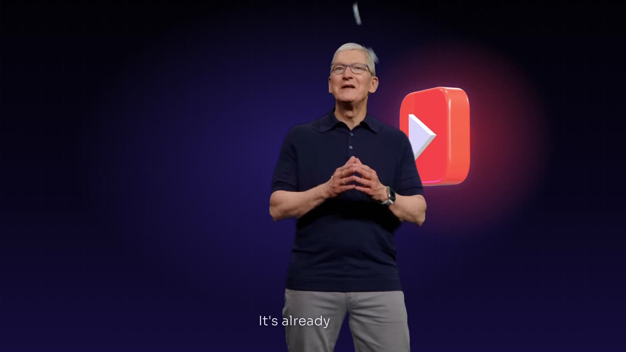
To add floating icons and titles over a keynote, pick a 1 to 3 minute section of a talk you have rights to and list the 3 to 6 key words that deserve a graphic. Ask for glossy icons around the speaker on those words, large titles behind them, small captions at the bottom and one accent colour.
Real outputs from the Videotto template gallery.
Ways to add keynote overlays, compared
There are three common ways to put motion graphics over a stage recording, and the right one depends on how many talks you have.
The manual route is a timeline editor plus a motion tool. In After Effects you would track the speaker, build or import 3D-style icons, rotoscope the speaker if titles sit behind them, and keyframe every move. Premiere Pro templates or CapCut text animations get you titles and icon pops faster, but titles behind a person still need masking by hand. Canva suits static title cards between shots.
| Method | What you get | Typical effort for a 90 s clip |
|---|---|---|
| After Effects (tracking, rotoscoping, 3D icons) | Full control over every layer and move | Roughly a full working day for an experienced motion designer |
| Premiere Pro or CapCut with templates | Titles and icon pops over the footage, simpler motion | Roughly 1 to 3 hours, more if anything sits behind the speaker |
| Canva title cards | Static or lightly animated cards between shots | Under an hour, but nothing moves around the speaker |
| Otto from a written brief | Icons, titles, captions and a reveal described in one prompt | A few minutes to write the brief, then a review pass and small fixes |
These are typical estimates, not measured results.
How to remaster a keynote with floating icons in 6 steps
Use your own company talk, or a keynote you have the rights or permission to edit. A 20 to 40 minute talk usually holds one or two sections strong enough to stand alone.
- Bring in the talk. Paste a YouTube link or upload the recording. Give the section you want with timestamps, or ask Otto to find the strongest two minutes.
- List the key words. Product names, features and the main claims. For a 90 second clip, 3 to 6 key words is plenty. These are the only moments that get a title or an icon.
- Describe the icons. Glossy 3D app style icons, frosted glass cards or simple line icons. Say what each one represents, using generic shapes rather than other companies' logos.
- Set the title style. Large bold words that rise behind or beside the speaker, two to four words at a time, in one colour. Each title should stay up for at least 2 seconds so people can read it.
- Add one big reveal. A glass globe, a product turning in 3D or the logo assembling. One reveal per clip, saved for the main announcement.
- Caption and check. Small clean captions at the bottom. Watch the whole clip once at full size and once on a phone, looking for any graphic that covers the speaker's face or hands, or a title edge that flickers around their outline.
A keynote overlay prompt to paste into Otto
Adapted from the way Videotto users brief Otto to remaster a keynote. Change the link, the words and the colours.
Remaster the keynote at [your YouTube link or uploaded talk], from [start time] to [end time], in 16:9 at 1920x1080.
Keep the speaker on stage as the main visual anchor. Do not replace or restyle the footage.
STYLE: dark navy stage, elegant blue light, glossy 3D icons, one accent #3D7BFF.
KEY WORDS: [feature 1], [feature 2], [feature 3], [product name].
ICONS: when a key word is said, a matching glossy icon floats in and orbits slowly around the speaker, then fades after 3 seconds.
TITLES: on the main lines, large bold titles rise behind the speaker, two to four words at a time, held at least 2 seconds.
REVEAL: one big reveal on [the key announcement], a glass globe that turns and glows.
CAPTIONS: small clean white captions at the bottom.
SOUND: keep the original audio, a soft shimmer on each reveal.
RESTRICTIONS: nothing over the face or hands, no other brands' logos, slow easing, no bouncing, no more than one graphic on screen at a time.
Short keynote prompts that also work
- "Add floating app icons around the speaker when the features are listed."
- "Big title behind the speaker on stage: the product name, then the tagline."
- "Make it feel like a launch event: dark stage, glass cards, one blue colour."
- "Cut the keynote to a 9:16 short with the titles stacked above the speaker."
- "Only three graphics in the whole clip, on the three biggest lines."
Example: a 90 second keynote clip, graphic by graphic
Here is how a brief turns into a finished clip. This is an illustrative example, not a real customer project. The input is a 35 minute founder keynote filmed on one wide camera, and the section chosen runs from 14:20 to 15:50, where three features and a launch date are announced.
The brief listed four key words ("offline mode", "shared folders", "one-click export" and the product name), asked for glossy blue icons, white titles and one globe reveal on the launch line. The result looked like this:
Beat sheet for the example clip
| Time | What the speaker says | Graphic on screen |
|---|---|---|
| 0 to 6 s | Opens with the problem | Captions only, no graphics yet |
| 6 to 12 s | "Offline mode" | A cloud-with-slash icon floats in at the left, orbits once, fades |
| 12 to 30 s | Explains offline mode | Captions only |
| 30 to 36 s | "Shared folders" | A folder icon rises on the right side of the stage |
| 36 to 55 s | Demo story | Title behind the speaker: "Work together" |
| 55 to 62 s | "One-click export" | An arrow icon slides up and settles above the speaker's shoulder |
| 62 to 80 s | Build-up to the launch | Captions only |
| 80 to 90 s | "Available worldwide today" | The glass globe turns behind the speaker and the product name assembles |
Five graphics in 90 seconds, with long stretches of plain footage in between, is what keeps it calm. The first review pass found one icon passing over the speaker's hand at 58 seconds, fixed with a single follow-up line: "move the export icon higher, above the shoulder."
What the keynote launch look is made of
The style comes from product launch events: a calm stage, a few huge words, objects that seem to float in space. The speaker never leaves the frame. The graphics appear around them, as if they were on the stage too.
| Ingredient | What works | How to say it |
|---|---|---|
| Stage | Dark, calm background, the speaker well lit | "keep the stage dark, the speaker as the anchor" |
| Icons | Glossy 3D or glass icons, generic shapes | "glossy app style icons that orbit slowly" |
| Titles | Two to four huge words at a time | "big bold titles rising behind the speaker" |
| Colour | One accent on a dark navy or black base | "navy stage, one blue accent" |
| Motion | Slow easing, nothing bounces | "slow, smooth, no bouncing" |
| Captions | Small and clean at the bottom | "small white captions, bottom of frame" |
The format changes where things go. A wide 16:9 stage at 1920x1080 gives icons room to orbit. A 9:16 short at 1080x1920 does not, so titles stack above the speaker and icons sit in the top third. For the vertical version, ask Otto to reframe to 9:16 on the speaker first, then add the graphics above them.
Keynote overlay mistakes to avoid
- Graphics on every sentence. Floating icons all the time look like a screensaver. Save them for product names and the key claims, roughly one every 15 to 20 seconds at most.
- Covering the speaker. An icon passing over the face breaks the illusion. Ask for graphics around and behind, never in front of the face.
- Other companies' logos. Use generic icons that show the idea. Do not add brand marks you have no permission to use.
- Too many colours. A launch look is calm. A dark stage and one accent beat a rainbow of icons.
FAQ
How do you put text behind a person in a video?
To put text behind a person in a video, the editor has to separate the person from the background and place the text layer between them. In After Effects that is usually Roto Brush, and in CapCut or Premiere Pro it means a mask or a background removal step. Clean edges matter most around hair and hands, so always check those frames before you export.
How long should a keynote highlight clip be?
A keynote highlight clip for social is usually 30 to 90 seconds, built around one idea or announcement. YouTube Shorts and Instagram Reels both allow up to 3 minutes, but a stage talk loses people quickly without a clear payoff. For LinkedIn or a website, a 2 to 3 minute 16:9 cut of the main announcement works well alongside the shorter versions.
What is the best aspect ratio for a conference talk video?
The best aspect ratio for a conference talk video depends on where it goes. Keep the full talk in 16:9 at 1920x1080 for YouTube and your website. Cut highlights to 9:16 at 1080x1920 for Shorts, Reels and TikTok, and 1:1 or 4:5 for feed posts on LinkedIn and Instagram, keeping the speaker centred in each crop.
Is it legal to edit and repost someone else's keynote?
Editing and reposting someone else's keynote is generally only safe with the rights holder's permission, which is usually the event organiser or the company that gave the talk. Short commentary or news use can fall under fair use in some countries, but that is decided case by case. Your own company's talks and events are the safest material to remaster.
Make your next video with Otto
Tell Otto what you want in plain words. It cuts, captions and animates the video for you.