To make bold Hormozi style captions, cut the pauses first, then add captions in a very heavy all caps sans, two or three words at a time, centred just below the chin. Add a thick black outline, colour one key word per caption in yellow or green, and make each chunk pop in with the voice.
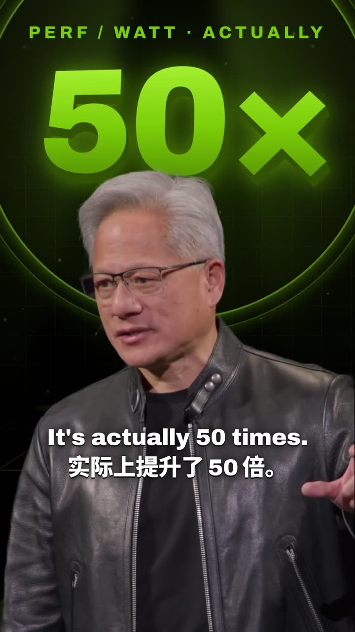
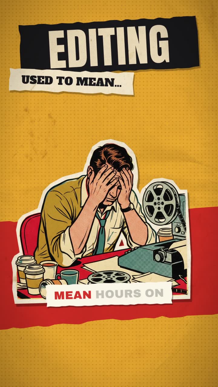
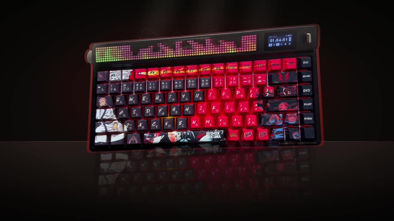
Real outputs from the Videotto template gallery.
How to make Hormozi style captions in 6 steps
The order matters. The captions only feel right on an edit that is already fast, so the pauses go before anything else.
- Upload the video. A talking head works best. Or paste a YouTube link to your own video.
- Cut the pauses and filler first. Ask Otto to remove pauses, filler words and mistakes. A typical unedited take loses a noticeable share of its length here, and the rhythm the captions need appears.
- Set the font and chunk size. Very heavy all caps, two or three words per caption. On a 1080x1920 frame that is roughly 90 to 130 pixels of cap height.
- Pick the key word colour. One or two bright colours. Yellow and green are the usual choices, red for warnings or mistakes.
- Mark the key words. Let Otto pick them, or list the words that must pop: numbers, results, names, the big claim.
- Add small effects. A soft pop sound on the biggest key words and a slight punch in zoom on your strongest line. Two or three per minute is enough.
Hormozi style caption prompt for Otto
Adapted from real requests Videotto users sent to Otto. It handles the pause cutting and captions in one go.
Edit my talking head video with bold business style captions, vertical 9:16.
Remove pauses, filler words and mistakes first.
Heavy white all caps captions, two to three words at a time, centred just below my chin.
A thick black outline. Each chunk pops in with my voice.
Key words in bright yellow, numbers and results in green. At most one coloured word per caption.
A soft pop sound on the biggest key words, a slight zoom on my strongest line.
Shorter bold caption prompts
- "Heavy white all caps captions with key words in yellow and green."
- "Bold white all caps captions a few words at a time, key word on a red highlight box."
- "Add pops on my keywords and whooshes on my zooms."
- "Same style, but in Indonesian."
Worked example: one sentence in bold captions
An illustration of how chunking and colour work on a single line. The speaker says: "I made ten sales in one day after I changed one thing in my offer." That is 15 words in about 4 seconds.
| Chunk on screen | Time | Coloured word | Effect |
|---|---|---|---|
| I MADE | 0.0 to 0.4 s | None | Pop in |
| TEN SALES | 0.4 to 1.0 s | "TEN" in green | Pop sound |
| IN ONE DAY | 1.0 to 1.6 s | None | Pop in |
| AFTER I CHANGED | 1.6 to 2.4 s | None | Pop in |
| ONE THING | 2.4 to 3.1 s | "ONE THING" in yellow | Slight zoom |
| IN MY OFFER. | 3.1 to 4.0 s | None | Hold |
Six chunks, two coloured moments, and the colours carry meaning: green for the result, yellow for the cause. Colouring "in" or "my" by accident is what makes captions look automated, so check the key words even if a tool picked them.
What makes bold captions look right
The style is about weight and rhythm. Few words, heavy type, the key word shouted in colour.
| Element | Looks right | Looks off |
|---|---|---|
| Font | Very heavy sans, all caps | Regular weight or mixed case |
| Chunk | Two or three words | Five or more words filling the width |
| Colour | White base, one key word in yellow, green or red | Every other word coloured |
| Outline | Thick black stroke or a strong drop shadow | No outline over a bright background |
| Motion | A quick pop or scale as each chunk lands | Slow fades, or a different animation each time |
| Position | Centred, just below the chin | Over the mouth, or at the very bottom under the app buttons |
The edit around the captions matters too. Tight cuts with no pauses, a punch in on the strongest lines and occasional B-roll for numbers. Slow, breathy pacing under loud captions feels mismatched. A plain or slightly blurred background behind you keeps white heavy type readable.
Bold caption tools compared
Typical effort estimates for a 60 second talking head clip with pauses cut and bold captions.
| Tool | How it works | Typical time |
|---|---|---|
| Premiere Pro | Cut pauses by hand, auto transcribe, style a caption track, colour key words one by one | Roughly 45 to 90 minutes |
| CapCut | Auto captions with bold templates, colour key words manually | Roughly 20 to 40 minutes |
| Descript | Edit the transcript to cut filler, then style captions | Roughly 20 to 40 minutes |
| Otto | One prompt for pauses, captions, colours and effects | A first draft, then a few minutes of follow up requests |
Most of the manual time goes into picking and colouring key words, not into the captions themselves. That is also the part worth checking by eye in any tool.
Fixes for bold captions that do not hit
| Problem | Fix |
|---|---|
| The screen is a wall of text | Cut to two or three words per caption |
| Nothing stands out | Colour one word per caption at most, and not every caption |
| It feels slow despite the captions | Remove pauses and filler before captioning |
| Captions cover your mouth | Move them just below the chin, never over the eyes or mouth |
| It looks like a copy of someone else | Use your own colours and font, never another creator's name, logo or template |
FAQ
What font is used for Hormozi style captions?
Hormozi style captions use a very heavy sans serif in all caps. We do not know the exact font any particular creator uses, but close matches are Montserrat ExtraBold or Black, Anton, Bebas Neue and similar heavy geometric or condensed sans fonts. Pick one that stays readable at phone size and has a free licence for commercial use.
How do you make Hormozi style captions in CapCut?
To make Hormozi style captions in CapCut, generate auto captions, choose a bold template or set a heavy font in all caps, add a thick black stroke, and limit each caption to two or three words. Then select key words one at a time and change their colour. Cut pauses first so the captions keep a fast rhythm.
What colours are used in Hormozi style captions?
Hormozi style captions usually use white text with a black outline, plus bright yellow or green for key words and occasionally red for mistakes or warnings. The colour should mean something consistent through the video, such as green for results. Limit it to one coloured word per caption so the highlight still stands out.
Do bold captions work for every niche?
Bold captions work best for business, motivation, fitness, sales and education content where a speaker makes direct claims to camera. For calm, premium or artistic content, the loud style can feel out of place, and smaller sentence case captions often fit better. Try both on similar clips and compare watch time in your own analytics.
Where should captions go on a vertical video?
Captions on a vertical video should usually sit in the middle third of the frame, just below the speaker's chin. The bottom fifth is covered by the app's caption text, username and buttons on TikTok, Reels and Shorts, and the right edge has like and share icons. Keep captions centred and inside that safe area.
Make your next video with Otto
Tell Otto what you want in plain words. It cuts, captions and animates the video for you.